Animal Welfare Foundation of Canada (AWFC) is a non-profit organization encouraging people to care for the needs of all animals. The goal of the organization is to advance the well-being of animals across Canada.
AWFC website functions as a tool for grant funding and provides a safe channel for donations, ensuring donor assurance by helping them select reputable and impactful animal welfare initiatives and providing users with the latest news and programs.
They’re in need of a content audit and a new information system. The goal for this project is to review the user needs and design the site architecture with those needs at the forefront.
The Frog Crawling Tool was first employed to conduct a comprehensive analysis of the entire AWFC website. The assessment focused on several key areas: the overall site structure, including the clarity of navigation and logical flow between pages; the quality and relevance of website content, ensuring it is accurate, complete, and regularly updated; SEO optimization, identifying potential issues such as missing meta tags, poor keyword usage, or slow loading speeds; user-friendliness and readability, with attention to layout, typography, information hierarchy, and mobile compatibility; and finally, the consistency and systematization of the design, evaluating the use of unified visual styles, reusable components, and consistent interactions across the site. This multi-dimensional analysis lays the groundwork for informed, strategic improvements.
A usability survey was conducted with 8 participants, who were asked to visit the AWFC website and complete the same set of tasks. The goal was to observe whether users could successfully complete these tasks and to assess the clarity and ease of navigation throughout the site. This helped identify common usability challenges, potential points of confusion, and areas where improvements could enhance user experience.
Follow-up Questions
Was it clear what you were supposed to do once you landed on the homepage?
Did you encounter any difficulties while completing the assigned tasks?
Which part of the website did you find most confusing or hard to navigate?
Was the information you needed easy to locate? Why or why not?
How would you describe your overall experience using the site?
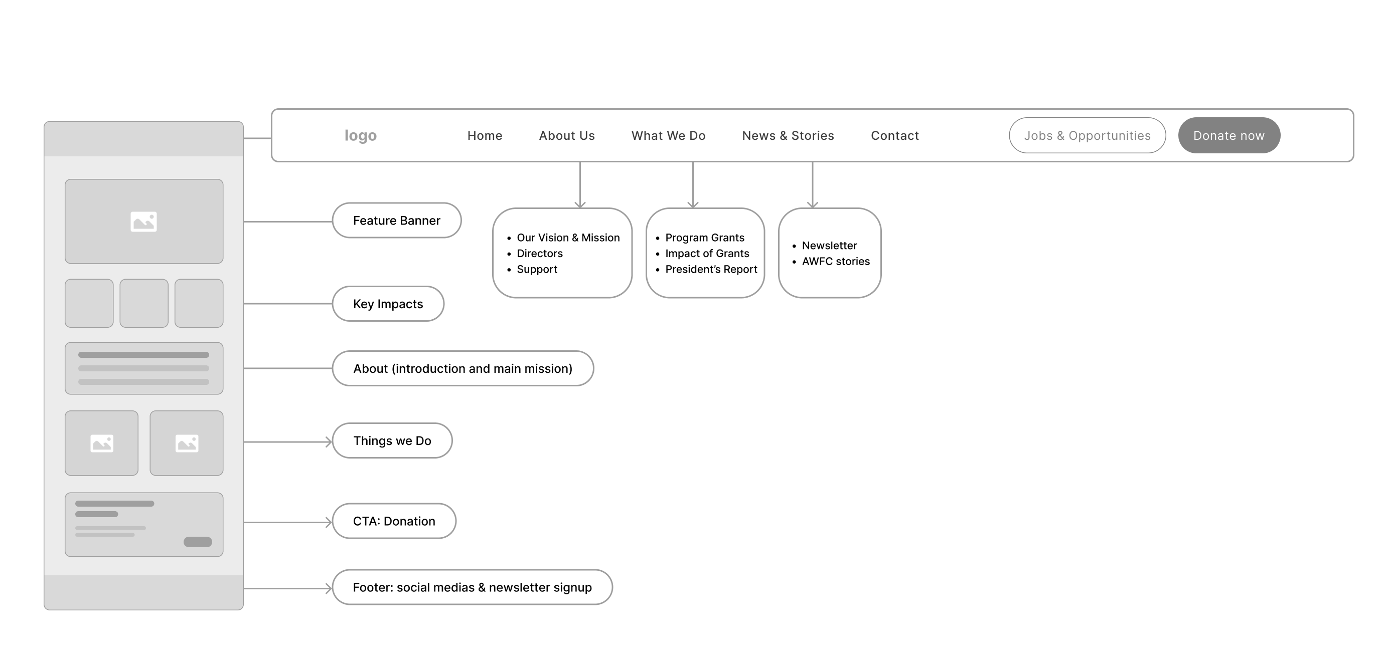
The website's main page consists of six main sections: the navigation bar, a photo gallery, text content of the foundation's information and news, a donate section, and a footer. The donate section aligns with AWFC’s goal to attract potential donors' attention. The website’s navigation system has seven parts with drop-down menus: “Home” “About” “Program Grants” “Support” “Directors” “Contact” and “Dontae”. The navigation system supports users in locating primary information.
To further improve the AWFC website, a competitor analysis was conducted using four similar nonprofit or NGO websites. Overall, enhancing visual hierarchy, streamlining navigation, and incorporating visual elements emerged as essential strategies consistently applied across these sites.
After conducting user interviews, all the participants responses were synthesized to identity themes, opportunities, and features that Maruti Subscribe as product could focus and improve upon.
The website currently lacks a clear and intuitive navigation system, making it difficult for users to locate specific pages due to ambiguous labeling. Several pages contain overlapping or repetitive content, which further contributes to user confusion.
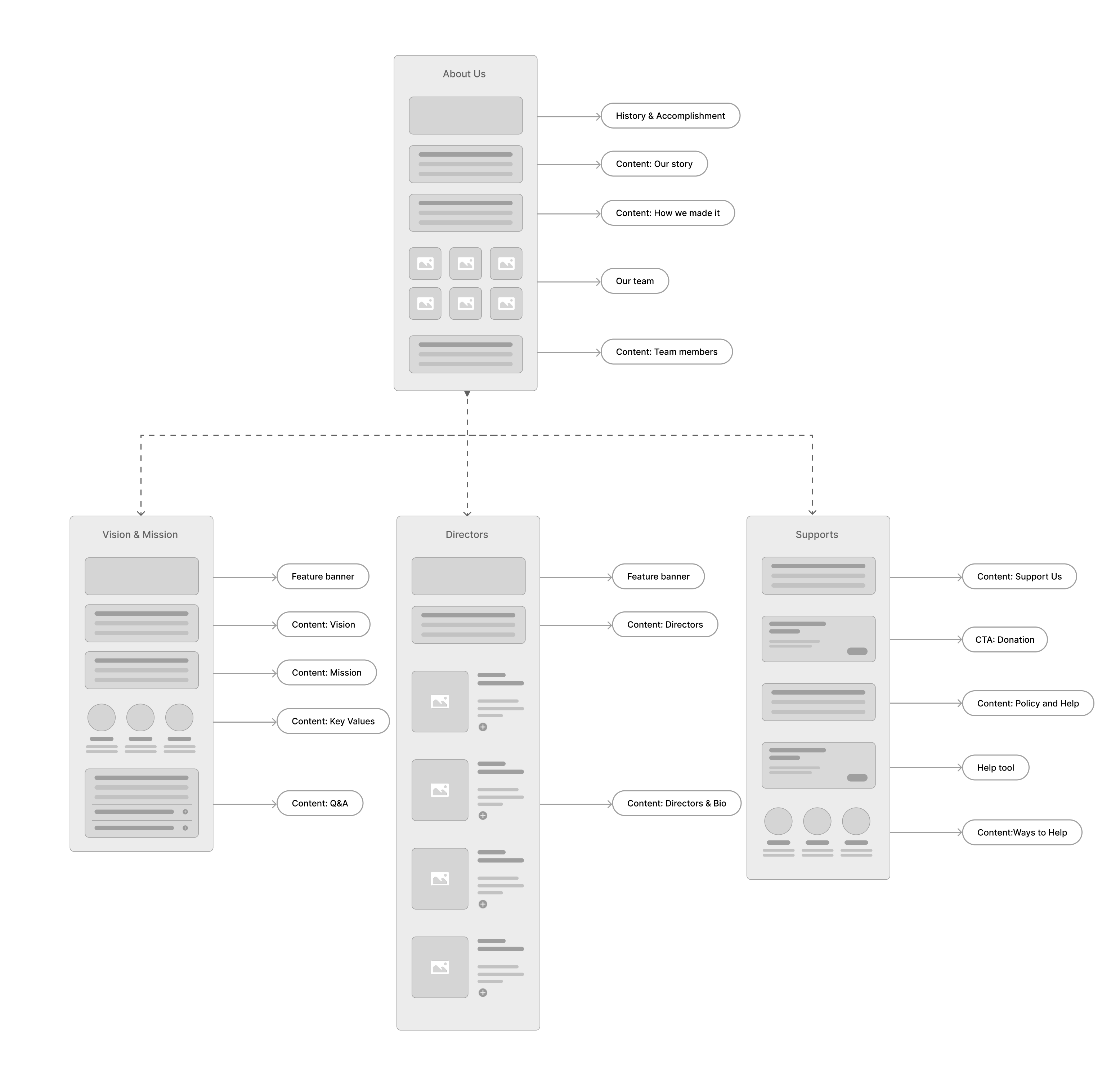
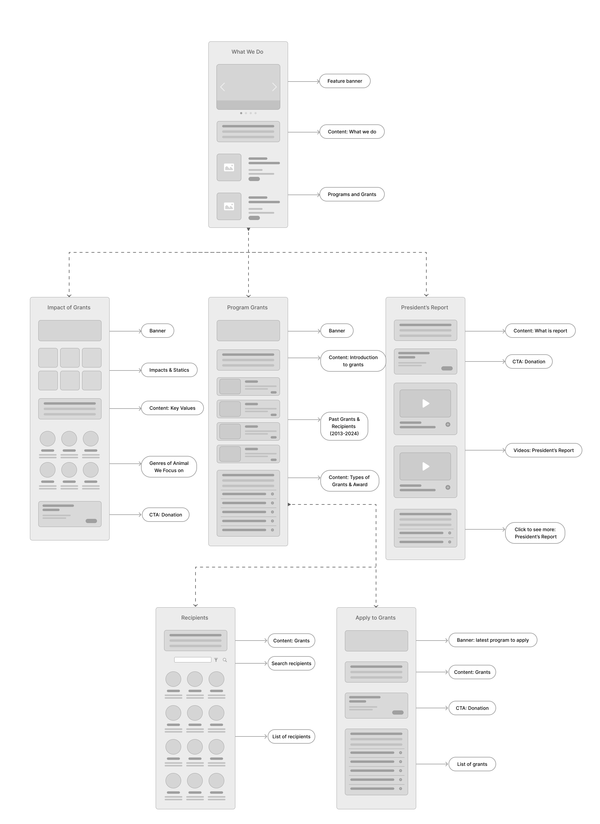
For example, the section on Program Grants combines general information about grant opportunities with details on the six program areas that AWFC supports. This layout can be misleading for users who are specifically looking for updates or outcomes related to AWFC-funded programs.
Additionally, the Home and About sections present similar content, despite their intended roles as distinct areas of the website. Technical issues are also present, including 20 URLs that return 404 errors, which negatively impact the site's SEO performance and user experience.
There is noticeable duplication of content between the Home and About sections, with repeated information that feels redundant and unnecessary. This repetition diminishes user engagement and makes navigation less efficient, as visitors may struggle to understand the distinct purpose of each section.
Additionally, the "What's New" section lacks timely updates on ongoing events and programs, which can lead to reduced user interest and a decline in trust, as the absence of fresh content suggests the site is not actively maintained.
The website lacks a clear visual hierarchy, which negatively impacts readability and overall user experience. The absence of a structured visual system results in inconsistent use of font sizes and styles, making it difficult to distinguish between headings, subheadings, and body text.
Key content, such as the president’s report, is not visually prominent—although it is accessible through the "Directors" section, it is actually categorized under the "About" section.
This misplacement, combined with the lack of visual cues, reduces the visibility of important information and makes it harder for users to locate relevant content efficiently.
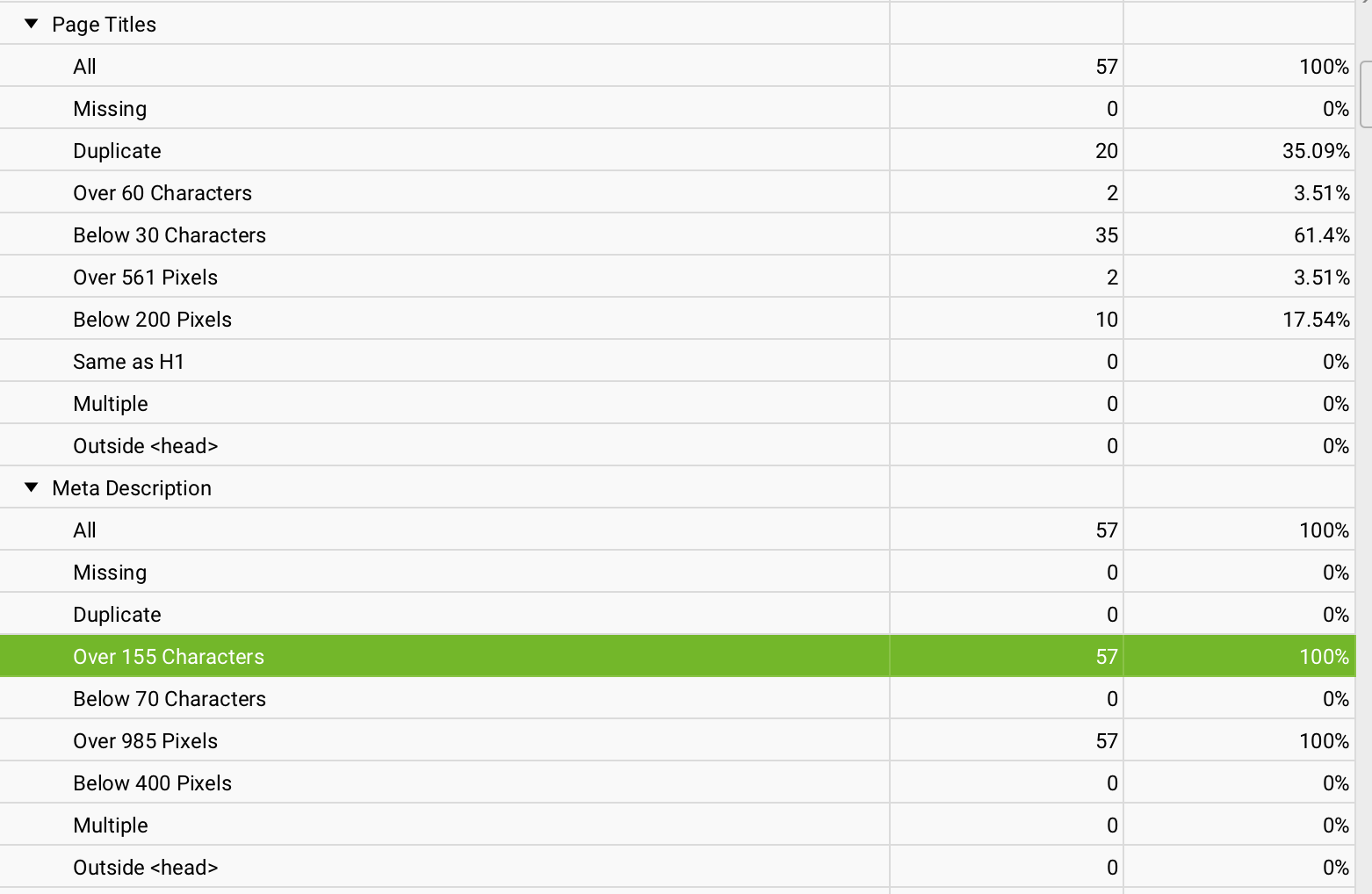
Several pages on the website have titles that exceed 60 characters, which goes beyond Google's recommended length based on pixel limits. This can lead to truncated titles in search results, potentially lowering the click-through rate as users may not immediately understand the page’s relevance.
Additionally, many meta descriptions surpass the optimal length of 155 characters, reducing their effectiveness in clearly and concisely capturing user attention. These SEO-related issues can hinder the site's visibility and overall performance in search engine rankings.
A wireframe was created and the sitemap was restructured to provide recommendations for improving the site's information architecture, with a focus on key elements such as navigation, the search system, and overall user experience.

The next step would be to refine the design system to ensure visual consistency and usability across all components. High-fidelity wireframes will then be developed based on the revised structure and layout. At this stage, a round of usability testing will be conducted to validate the design choices and gather user feedback. Upon approval from stakeholders, the final designs will be prepared for development, with collaboration between design and engineering teams to ensure accurate implementation on the backend.